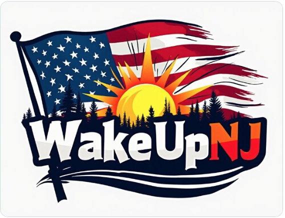
I already know what I created is crap it can certainly be better. This was just a quick MS Paint edit and threw some words on there. Have you tried using AI to generate pew pew pics? It’s hilarious and horrible at the same time!
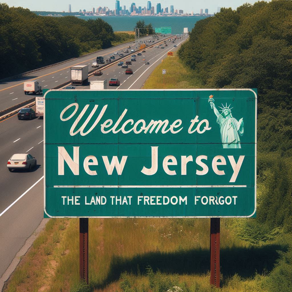
Can anyone make something better for the main logo?
Please submit your creation on this tread and winner will be whatever has the most likes.
Eventually I would like to get supporter patches made for Premium subscribers and donators with whatever logo it becomes.
The logo will be the public face of the site. It shouldn’t be anything too aggressive in my opinion. It should be simple and straightforward and not look like an Ed Hardy T Shirt or a poster from a truck stop gift store in West Virginia.